
"Going home"
Photo created by Ed Clark (Life Magazine)
Image Source:
http://www.thegreatleapsideways.com/?p=209
I can almost guarantee that when each of my peers reflect on this picture we will all have a completely different reaction and perception. Personally, when I viewed this image I was immediately drawn to the anguish on the main subject's face. His pain is apparent but we do not know why by just looking at the image alone. The other participants in the background also contribute to the somber mood. The main subject's expression looks genuine and is very heartrending. We can see that that the man depicted in the foreground is in the Navy from the emblem on the cap he wears. As a result, I strongly believe that this may have a more powerful and profound effect on other military personnel and their family members. I have never endured a family member in the military so it is more difficult for me to relate. Individual experiences are inextricably linked to perspective and interpretation. After I researched the context of the photograph I learned that the "navy shipman Graham Jackson is following the funeral train on the occasion of Franklin D. Roosevelt's burial." Therefore, his expression is very fitting for this scenario.
Principle 1: Subject’s
Expression
The main subject is not overly posed and the anguish and emotion are very clear for everyone to witness. This expression looks natural and genuine and his behavior and body language are professional considering his role as a navy shipman on duty.
Principle 2: What feelings did the
image create?
This image was very tough to swallow. Although from the image alone we do not gain insight into the context/situation, the main subject's expression implies extreme tragedy and loss. Also the fact that the man is close to tears adds to the emotional intensity. It is not very often that you see a man close to tears like this.
This image was very tough to swallow. Although from the image alone we do not gain insight into the context/situation, the main subject's expression implies extreme tragedy and loss. Also the fact that the man is close to tears adds to the emotional intensity. It is not very often that you see a man close to tears like this.
Principle 3: Contrast Appropriate

Photo created by Jodi Bieber (Time Magazine)
Image Source: http://kwikwee.com/2012/07/22/aesha-the-afghan-girls-tough-journey-after-international-fame/
I remember the story pertaining to the (above) image very well. We discussed it in-depth in an introduction to journalism class. Here is a little bit of context for those of you who are not familiar with the situation. "Bibi Aisha, an 18-year-old woman from Oruzgan province in Afghanistan, fled back to her family home from her husband's house, complaining of violent treatment. The Taliban arrived one night, demanding Bibi be handed over to face justice. After a Taliban commander pronounced his verdict, Bibi's brother-in-law held her down and her husband sliced off her ears and then cut off her nose. Bibi was abandoned, but later rescued by aid workers and the U.S. military," (source 1).
Why does this represent truth to me?
Many people could argue I have my own personal bias or prejudice towards this image due to the fact that I am female. However, in my opinion, it doesn't get much more real than this, regardless of whether you are a male or female. This poor innocent girl was subjected to unimaginable pain and suffering and her scars are there for the whole world to see. This image coincides with Shahidul Alam's activist approach to photojournalism and supports his "Majority World." Women in Afghanistan are simply inferior (for lack of a better word).
However, I fully appreciate that the world is far from equal and there are numerous ways to view things. As a result, opponents could argue that Bibi Aisha deserved this treatment for her defiant behavior towards her husband. Overall, I believe this is a true, accurate, and objective depiction of the potential dangers associated with living in this part of the world. Bibi Aisha is portrayed with dignity and despite everything she has endured, she can hold her head up high, "Opening Doors, Opening Minds." In addition, this image further reinforces the development and progression of the field of photojournalism, previously it was frowned upon to photograph and print portraits of women.
Principle 1: Keep it Simple
Bibi Aisha's head shot is the only object in this composition. This is very effective as she receives our undivided attention and there are absolutely zero distractions. Due to the absence of her nose, you are immediately drawn to this part of her face as it is atypical and unnatural.
Principle 2: TextureBibi Aisha's head shot is the only object in this composition. This is very effective as she receives our undivided attention and there are absolutely zero distractions. Due to the absence of her nose, you are immediately drawn to this part of her face as it is atypical and unnatural.
The place where Bibi Aisha's nose was removed creates intese texture. Although it makes me grimace a little, her now healed scars are evident and always will be. However, the open hole is a harsh reminder of her ordeal. Moreover, the head scarf she wears also contributes texture to the image.
This image of Bibi Aisha reminds me of the image (below). Both subjects are young minority girls adhering to specific cultural norms. In each photograph, there is a powerful element that really stands out and draws/lures you in.
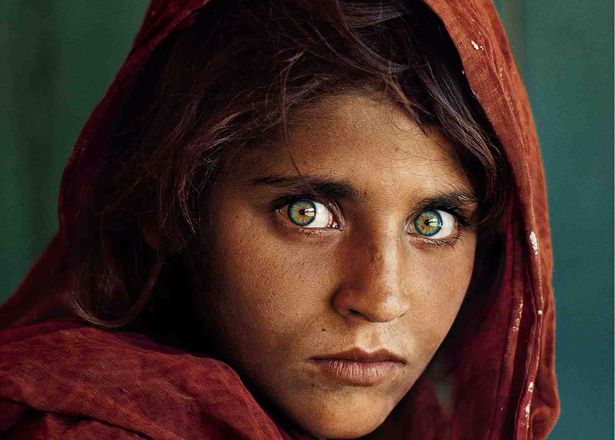
Photo created by Steve McCurry
Image Source: http://myhigherdrive.com/be-prolific/

Photo created by Paulo Whitaker
This image was taken in May 2008 and illustrates "more than a million gays and transsexuals parading in Brazil's capital Sao Paulo on Sunday in what was billed as the world's largest gay march to urge an end to violence and discrimination," (source 2).
Why does this NOT represent truth to me?
Although this image is "supposed" to document Brazilian advocates of gay rights and equality, in my opinion this is not a good visual representation and sends out completely the wrong message. The stereotypical rainbow flag is masking the identities of these supporters. The camera angle used her is crucial and further contributes to the inferior stigma. Bettye Lane definitely would not have been satisfied with the portrayal of this minority group and their struggle.
Principle 1: Rule of Thirds
This image does not adhere to the rule of thirds primarily because it does not include a main subject. As a result, it is dull and uninteresting and consists only of the colored flag. Disregarding the context and meaning behind the image, it is far from aesthetically pleasing.
Principle 2: Use of Lines
As the viewer, I was imemdiately aware of the distinct vertical lines on the flag. The only purpose they serve is to segregate the colors of the rainbow. The creases within the flag itself add realism and texture to the photgraph. Yet again, the flag is the main focus as there is nothing much else to look at.
Principle 3: Abstraction
The above image is representational of the iconic rainbow symbol assoicated with LGBT. However, we see legs and feet as opposed to the faces of these advocates. This in my opinion is far from appropriate and extremely bias.
Works cited:
No comments:
Post a Comment